How to Read a Stock Chart: Support, Resistance, Trends & Moving Averages
Learn to read what price is doing first—then use broader-market context to judge whether the setup has support behind it.
A stock chart can look like a wall of candles, lines, and indicators. But underneath all that noise, every chart is telling a simple story: where buyers took control, where sellers pushed back, and which side is currently gaining ground.
You do not need ten indicators to begin reading that story. Start with four building blocks: support, resistance, trend structure, and moving averages.
Once you understand those concepts on an individual chart, tools such as the MaicaTrades Market Score and Market Breadth can add a second layer: whether the broader market is helping or fighting the setup you see.
1. Start with price—not predictions
Every candle summarizes price movement during a chosen period. On a daily chart, one candle represents one trading day. A green candle generally means price closed above its open; a red candle means it closed below its open. The thin lines, or wicks, show the session's high and low.
One candle matters less than its location. A strong green candle in the middle of a messy range may mean very little. The same candle breaking above a well-tested resistance area—while the broader market is healthy—can be far more meaningful.
Before asking, “Will this stock go up?” ask:
- Where has price repeatedly changed direction?
- Is the stock forming higher highs and higher lows, or lower highs and lower lows?
- Is price above or below important moving averages?
- Is the move supported by broad market participation?
2. Support: where buyers have previously stepped in
Support is an area where buying demand has been strong enough to slow or reverse a decline. It often forms near a previous low, a breakout level, a moving average, or a price area where heavy trading occurred.
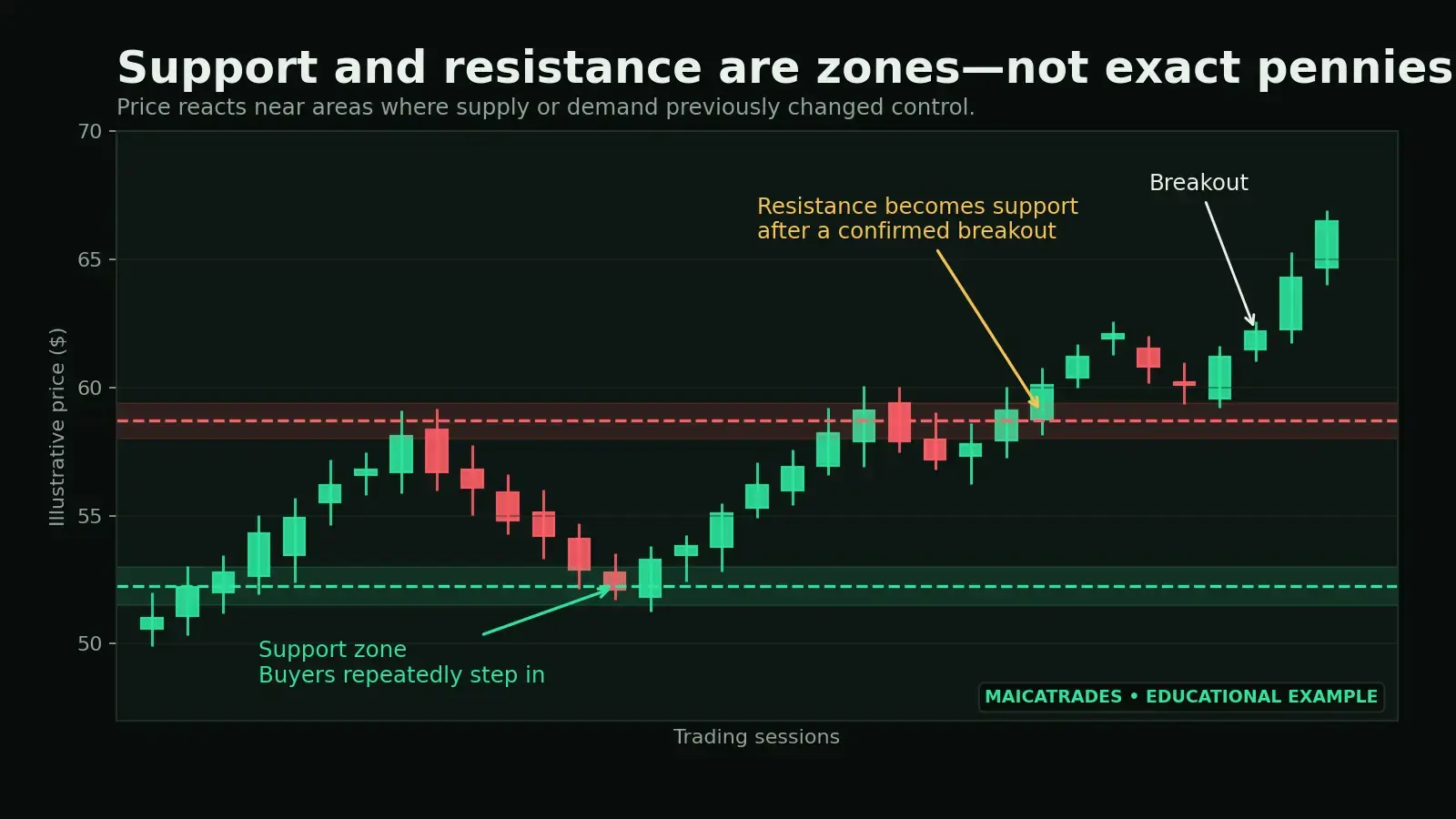
Think of support as a zone rather than an exact price. If a stock bounced near $50.10, $49.85, and $50.35 on different days, the useful conclusion is not that $50.10 is magical. It is that buyers have shown interest around the $50 area.
What makes support more meaningful?
- Price has reacted there more than once.
- The reaction was decisive, not a tiny bounce.
- The area lines up with another reference point, such as a moving average or prior breakout.
- The stock approaches the level in an orderly pullback rather than a disorderly collapse.
- The broader market is stable or improving.
Support is not a guarantee. When buyers stop defending the area, price can break through it quickly. That is why traders often define invalidation or stop placement below the level that must hold for their idea to remain valid.
3. Resistance: where sellers have previously taken control
Resistance is an area where selling pressure has repeatedly slowed or reversed an advance. It can form near a prior high, the top of a trading range, or a level where trapped buyers may be waiting to exit.
As price approaches resistance, watch whether momentum expands, whether price closes above the area instead of only wicking above it, whether the breakout holds on a retest, and whether the broader market confirms the move.
A breakout is more convincing when price moves through resistance and then treats that old ceiling as a new floor. This is called a resistance-to-support flip.
Waiting for confirmation may mean entering slightly higher, but it can also reduce the risk of buying a failed breakout.
4. Trends: read the sequence of highs and lows
A trend is not simply whether today's candle is green or red. It is the structure created over multiple swings.
Higher highs and higher lows
Lower highs and lower lows
Movement between support and resistance
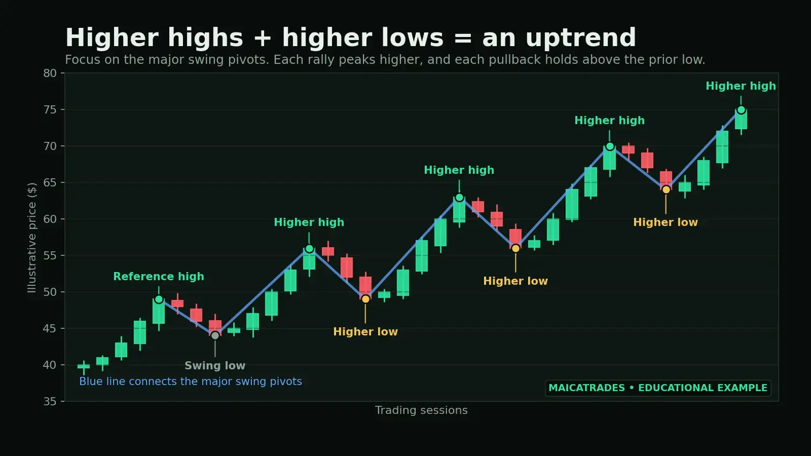
In an uptrend, buyers are willing to pay higher prices on each advance, and pullbacks are being defended above prior lows. A red day can occur inside a healthy uptrend. Controlled pullbacks are normal.
The trend becomes questionable when its structure changes—for example, when price fails to make a new high and then breaks below the most recent higher low.
Use more than one timeframe
A stock can be in a short-term downtrend inside a long-term uptrend. That is not a contradiction; it is a pullback viewed from two different distances.
- Use the weekly chart to identify the larger direction and major levels.
- Use the daily chart to evaluate the current setup.
- Use a shorter timeframe only if it helps refine the entry—without overriding the larger structure.
5. Moving averages: a cleaner view of direction
A moving average smooths price over a chosen number of periods. It helps organize the chart and makes the prevailing direction easier to see.
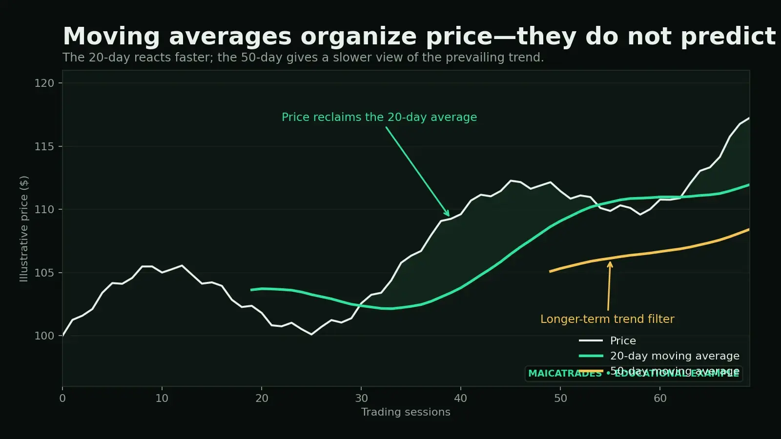
The 20-day moving average is faster and more responsive to recent price movement. The 50-day moving average is slower and useful for viewing the intermediate trend.
When price is above a rising moving average, the trend is generally healthier than when price is below a falling one. But the line itself is not a buy signal. Price can cross above and below an average repeatedly in a choppy market.
Useful moving-average questions
- Is the average rising, flat, or falling?
- Is price holding above it or repeatedly losing it?
- Does the average line up with prior support or a breakout level?
- Did price reclaim the average with strength, or barely drift above it?
- Is the broader market trend supportive?
The strongest use of a moving average is often confluence. A pullback into the 20-day average becomes more interesting when it also meets a prior breakout area and preserves a higher low.
6. Put the pieces together
Suppose a stock has a rising 50-day moving average, a sequence of higher highs and higher lows, a controlled pullback toward prior resistance, and the 20-day moving average rising into the same area.
That is not four separate signals. It is one story told four ways: the trend is up, the pullback is approaching a logical support zone, and the setup has a clear level that can invalidate the idea.
Context beats indicator collecting.
7. Add the MaicaTrades Market Score
After reading the individual chart, zoom out to the overall market. The MaicaTrades Market Score combines several parts of the environment—including trend, momentum, breadth, sector strength, and volatility—into one easier-to-read snapshot.
It does not replace chart analysis, and it does not tell you what stock to buy. Its value is helping you answer a different question: How supportive is the current market environment for taking risk?
- A clean breakout may deserve more confidence when the Market Score shows a broadly healthy environment.
- The same breakout may require more caution when volatility is elevated, breadth is weak, and the market trend is deteriorating.
- A lower score may mean using smaller size, demanding stronger confirmation, taking profits more deliberately, or passing on marginal setups.
The Market Score is best used as a risk-context tool, not a substitute for judgment.
8. Use Market Breadth to test the trend
Major indexes can rise even when only a small group of large stocks is doing most of the work. That is why Market Breadth matters.
Breadth measures participation: how many stocks are advancing, holding healthy trends, or confirming the index's direction.
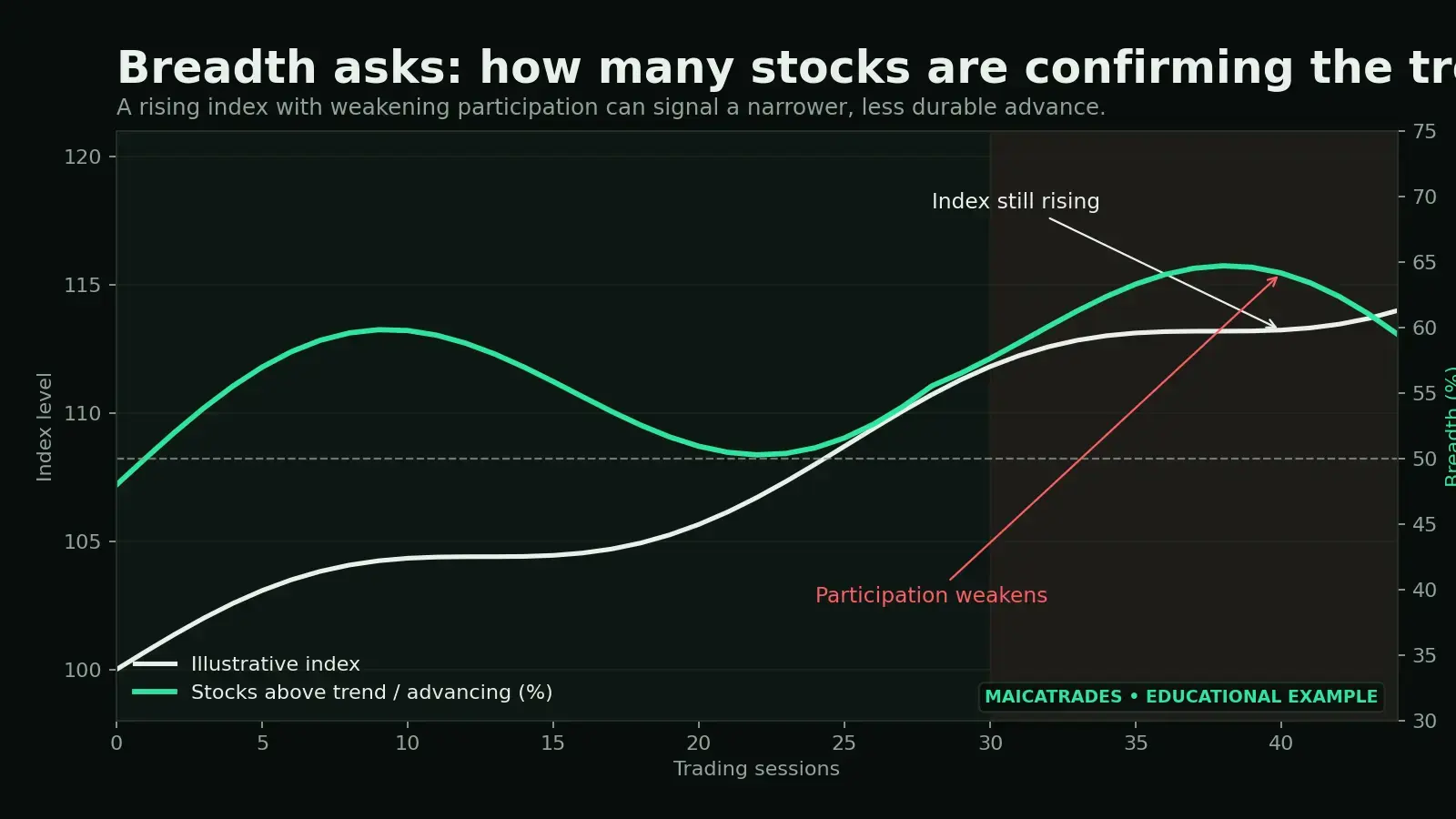
MaicaTrades tracks participation across a broad group of stocks to help show whether strength is spreading through the market or becoming concentrated in fewer names.
Imagine the S&P 500 or Nasdaq is making a new high, but fewer stocks are advancing or holding above key trend measures. The index trend is still up, but the foundation beneath it may be narrowing. That does not guarantee an immediate reversal. It tells you the move may be less forgiving.
For a swing trader, healthy breadth can create a better environment for breakouts and continuation setups. Weak breadth can favor selectivity, faster profit-taking, and tighter risk control.
9. A simple chart-reading routine
10. Common chart-reading mistakes
Treating a level as an exact penny. Support and resistance are usually zones.
Calling one green candle an uptrend. Trend requires a sequence of price swings.
Using a moving-average cross as a complete strategy. Moving averages work best with structure and context.
Ignoring the broader market. Even strong stocks can struggle when the environment becomes hostile.
Confusing confirmation with certainty. A high-quality setup can still fail. Risk management remains essential.
Adding too many indicators. More lines do not always create more clarity.
Final takeaway
Reading a stock chart starts with the language of price. Support shows where buyers previously defended an area. Resistance shows where sellers stopped an advance. Trend structure reveals which side is gaining control. Moving averages help organize that structure.
Once those basics make sense, the MaicaTrades Market Score and Market Breadth become more valuable—not because they replace the chart, but because they help you understand the environment around it.
Depth without complexity. Read the stock. Read the market. Define the risk.
Educational content only. Nothing in this article is financial advice or a recommendation to buy or sell any security. Trading involves risk, including the possible loss of principal.